
TL;DR

Get audio and creator gear delivered free with Prime
- Fast, free delivery on millions of items
- Prime Video, Amazon Music and more included
- Member-only deals all year
Frequency response charts reveal how a monitor reproduces sound across the spectrum. To read them without marketing bias, focus on flatness, range, and real-world data. This helps you pick monitors that match your needs, not just marketing buzz.
Focus on the flatness of the response line from 20 Hz to 20 kHz; small variations are normal, large peaks aren’t.
Sharp peaks or dips often indicate resonances or coloration that can distort your mix or listening experience.
Recent measurement tech makes charts more trustworthy—don’t rely solely on marketing claims.
Compare multiple charts and data sources before making a decision; one chart isn’t the full story.
Remember, a monitor with a flat response in a controlled environment may still sound different in your room—consider room acoustics.
What Are Frequency Response Charts — And Why They Matter
Frequency response charts are visual maps of how a monitor reproduces sound across the audible spectrum, from 20 Hz deep bass to 20 kHz shimmering treble. They show the amplitude at each frequency—basically, how loud each note sounds.
While marketing might claim a monitor is “flat” or “neutral,” these charts reveal the real story. They help you understand if a monitor colors the sound—boosting bass or cutting treble—or stays true to a neutral profile. Knowing this shapes your decision, especially if you mix music professionally.
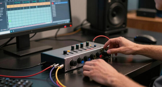
studio monitor frequency response chart
As an affiliate, we earn on qualifying purchases.
As an affiliate, we earn on qualifying purchases.
How to Spot a Flat Response and Why It’s Your Best Bet
The goal is a response line that stays as close to flat as possible across the spectrum. Imagine a gentle, even wave—no sharp peaks or dips. Flatness means the monitor reproduces all frequencies evenly, giving you an honest sound.
Look for charts with minimal spikes or valleys. For example, a monitor with a 3 dB peak at 2 kHz will sound brighter than intended, possibly skewing your mix. Conversely, a dip in the bass range might make your kick drum seem less punchy.
Real-world example: a flat response from 50 Hz to 15 kHz with less than ±2 dB variation generally indicates a well-balanced monitor suitable for critical listening.
However, it’s important to understand that perfect flatness is rarely achievable in real-world conditions. Slight deviations are normal, but large, sharp peaks or dips can cause your mixes to translate poorly to other systems. Flat response charts generally suggest a monitor that offers a balanced, uncolored sound—crucial for mixing and mastering, where you want to hear your music as accurately as possible.
Understanding the implications of flatness helps you anticipate how a monitor will behave in your space. For instance, a slightly uneven response might be acceptable if it emphasizes certain frequencies you prefer, but be cautious—excessive peaks or dips can mislead your mixing decisions. The tradeoff often involves balancing flatness with personal preferences or room influences, but aiming for as flat a response as possible remains the gold standard for accuracy.
As an affiliate, we earn on qualifying purchases.
Deciphering Peaks, Dips, and Resonances — What They Really Mean
Peaks and dips are the sharp rises and falls in the response chart. For instance, a spike at 1 kHz might make vocals sound honky or nasal. A dip in the 200 Hz range could thin out the bass, making it less impactful.
Resonances are often seen as narrow, tall peaks—these are usually caused by cabinet or driver resonances. They can color the sound, making some notes overly prominent or dull.
Understanding these features is vital because they directly influence how you perceive the sound. For example, a peak at 3 kHz can exaggerate sibilance or harshness, leading you to compensate improperly during mixing. Conversely, a dip in the midrange might cause you to boost certain frequencies, resulting in an unnatural sound. Resonances tend to be narrow and sharp, often indicating a design issue or material resonance in the monitor’s construction. These can cause certain frequencies to be overly emphasized or suppressed, distorting your perception of what’s truly happening in your mix.
Real-world tip: If a chart shows a significant peak over 5 dB, expect that frequency to be exaggerated in actual listening—use this info to judge if it suits your mixing style or preference. Recognizing these anomalies helps you anticipate how a monitor will color your sound and whether it aligns with your needs.
Beyond just identifying peaks and dips, it’s important to consider their potential causes and how they affect your listening. Sharp peaks can lead to listening fatigue or misjudged EQ decisions, while dips may cause you to compensate with boost, resulting in an unnatural balance. Recognizing resonances helps you evaluate whether a monitor’s coloration is a design flaw or a characteristic you can work with, depending on your style and environment.
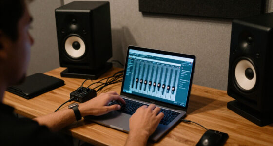
professional studio monitor speakers
As an affiliate, we earn on qualifying purchases.
As an affiliate, we earn on qualifying purchases.
Compare Charts Side-by-Side — Which Monitors Are Truly Flat?
| Monitor Model | Frequency Range | Flatness (dB) | Notable Peaks/Dips |
|---|---|---|---|
| Monitor A | 20 Hz – 20 kHz | ±2 dB | No major peaks or dips |
| Monitor B | 22 Hz – 19 kHz | ±3 dB | Peak at 3 kHz +2 dB |
| Monitor C | 20 Hz – 20 kHz | ±4 dB | Dip at 200 Hz -3 dB |
This side-by-side comparison shows that even some popular monitors aren’t perfectly flat. The best choice is the one with the least variation, especially if you’re doing detailed mixing. Remember, small differences in response can lead to noticeable shifts in your mix translation. Choosing a monitor with minimal peaks and dips reduces the risk of misjudging frequencies, making your mixes sound more consistent across different playback systems.
As an affiliate, we earn on qualifying purchases.
Recent Tech and Data—Making Charts More Trustworthy
New measurement tools and software have boosted chart accuracy. Instead of vague marketing claims, now you get raw data—often in downloadable files—showing how monitors perform in real-world settings.
Some charts include measurements taken in typical studio environments, not just anechoic chambers. This gives you a better idea of how a monitor will sound in your room, which often adds coloration to the response.
Plus, combining response data with distortion and off-axis measurements paints a fuller picture of a monitor’s true character—something marketers rarely reveal.
Understanding these technological improvements helps you better interpret charts, recognizing that real-world measurements—especially those taken in typical studio conditions—are more relevant for practical use. This transparency reduces guesswork and allows you to make more informed decisions, but keep in mind that even the best data can be affected by your room acoustics and setup.
Don’t Trust Charts Alone — Use Other Clues to Pick a Good Monitor
Charts are a vital piece of the puzzle, but not the whole story. Consider room acoustics, speaker placement, and your personal listening preferences.
If you see a monitor with a slightly uneven response but excellent off-axis and low distortion measurements, it might still be a good fit. Conversely, a flat response in a controlled environment might not translate well to your space.
Real-world tip: Cross-reference multiple sources—reviews, measurement data, and your own listening tests—to get the full picture before buying. No single measurement or chart can capture all the nuances of how a monitor will sound in your specific environment, so combine data with your experience.
What You Should Really Look For in a Response Chart
Focus on a chart with a response line that’s mostly flat from 50 Hz to 15 kHz. Minor fluctuations are okay, but large peaks or dips signal potential coloration.
Check the response in the bass (20-200 Hz), mids (200 Hz–2 kHz), and treble (2 kHz–20 kHz). Extended and even response in these ranges suggests a versatile, reliable monitor.
Be wary of sharp resonances or narrow peaks over 4 dB—they can exaggerate certain sounds, leading to inaccurate mixes or listening fatigue. Recognizing these features helps you understand the compromises involved and select monitors that best suit your critical listening needs.
Your Practical Checklist for Reading Response Charts
- Identify the overall flatness of the line across the spectrum.
- Note any sharp peaks or dips, especially over 3 dB.
- Compare the bass, midrange, and treble responses for evenness.
- Check for resonance issues—narrow, tall peaks.
- Look for multiple measurements or data points, not just a single chart.
Use this checklist every time you review a monitor’s response chart. It’s simple but effective in helping you spot potential issues and understand the monitor’s true character before making a purchase decision.
Frequently Asked Questions
How do I interpret peaks and dips in the response chart?
Peaks make certain frequencies sound exaggerated, while dips reduce their presence. Both can cause coloration, so look for charts with minimal sharp variations for more accurate sound.Are all monitors with flat response charts good?
Not always. A flat response is ideal for critical mixing, but personal preference, room acoustics, and intended use also matter. Use response charts as a guide, not the only deciding factor.Can I rely on a single measurement?
It’s better to look at multiple measurements from different sources or environments. This helps account for variability and gives a fuller picture of a monitor’s true performance.What does a ‘smooth’ response look like?
A gently undulating line with no sharp peaks or dips over 2-3 dB. It indicates consistent reproduction across the spectrum.How much do room acoustics influence these charts?
Room reflections and placement can color the sound, so charts measured in anechoic chambers may differ from what you hear in your space. Always consider your environment when interpreting response data.Conclusion
Reading frequency response charts without marketing hype turns your monitor shopping into a data-driven process. Focus on flat, consistent responses and use multiple data sources. Then trust your ears—your best judge of what sounds right in your studio. Remember, understanding what these charts reveal is your secret weapon for better mixes and smarter gear choices.Halloween Picks
halloween
As an affiliate, we earn on qualifying purchases.