
TL;DR

Get audio and creator gear delivered free — and shop member deals
- Fast, free delivery on millions of items
- Access to Prime Big Deal Days deals on October 6–7
- Prime Video, Amazon Music and more included
Gamut coverage numbers tell part of the story; what truly matters is how well the display’s color space matches your workflow. Accurate calibration and understanding your target medium are key to reliable color reproduction, not just headline percentages.
Ever been frustrated by colors that look great on your screen but fall flat or oversaturated after export? That’s because the numbers on your pen display’s specs only tell part of the story. Understanding which color gamut coverage really matters can save you headaches and ensure your art looks consistent everywhere.
In this guide, you’ll learn what gamut coverage is, why it’s not always the biggest number that counts, and how to pick a display that aligns with your creative workflow. No fluff, just practical advice you can trust.
Gamut percentage alone is misleading; focus on how well the display’s color space matches your workflow’s needs.
Calibration and uniformity are more important than the advertised gamut size—accurate, consistent colors ensure your work looks right everywhere.
For most artists, near-100% sRGB coverage with good calibration offers the best balance of accuracy and reliability.
Wider gamuts like Adobe RGB or Display P3 are beneficial for print and video professionals, but only if the display is accurately calibrated.
Regular calibration, proper profiling, and understanding your target medium are essential for maintaining color fidelity over time.
Artist display field guide · color management
Pen Display Color Accuracy: Which Gamut Coverage Matters
Gamut percentages tell only part of the story. Reliable color comes from matching the display to your output, then controlling calibration, profiling and panel uniformity. For many artists, accurate near-100% sRGB beats a poorly managed “120% sRGB” display.
Coverage, volume and accuracy are different
A headline percentage can describe the size of a display’s gamut without proving that it fully covers your target space—or reproduces any individual color correctly.
Does it contain the target?
Gamut coverage measures how much of a reference space—such as sRGB or Adobe RGB—falls inside the display’s reproducible range.
How large is the range?
Gamut volume counts the display’s whole color range, including colors outside the target. “120% sRGB” usually describes volume, not accuracy.
Are colors actually correct?
Color accuracy compares displayed colors with intended values. Delta E reports the size of the difference; lower values are better.
Which coverage do artists really need?
Choose for the medium where the work will be delivered. Wider is valuable for print and premium video, but unnecessary gamut can complicate an otherwise simple web workflow.
| Primary use | Practical target | Why it fits | Workflow note |
|---|---|---|---|
| Web art, social media, comics, UI | Near-100% sRGB | Best general fit | Export with an embedded sRGB profile. |
| Modern illustration and multimedia | Strong Display P3 | Wider device reach | Use color-managed software and tagged files. |
| Photography and print production | High Adobe RGB | Cyan-green range | Soft-proof with the printer or paper ICC profile. |
| Standard HD video | Accurate Rec.709 | Delivery standard | Confirm gamma and viewing conditions. |
| HDR and high-end video finishing | P3-class + HDR | Specialist setup | Also verify luminance, contrast, bit depth and HDR controls. |
Practical gamut reach by workflow
Conceptual comparison · not to scaleWhy “120% sRGB” may mislead
A display can extend far beyond sRGB in a few directions while missing colors elsewhere. In unmanaged software, the extra range may also make ordinary sRGB content appear oversaturated.
120% volume is not 120% accuracy
The number usually says the display gamut has more total area or volume than sRGB. It does not prove complete sRGB coverage, neutral gray balance, correct skin tones or consistent color from center to corner.
A useful average target, but inspect maximum error too. A good average can hide a few visibly inaccurate colors.
The specifications that keep color trustworthy
Coverage establishes the available palette. These supporting characteristics determine whether that palette stays smooth, consistent and dependable in daily work.
Calibration evidence
Check the tested color space, average and maximum Delta E, white point, gamma target and whether each unit receives a report.
Panel uniformity
Brightness and color temperature should remain consistent across the screen—not merely at the center measurement point.
Hardware calibration
Internal lookup-table correction can preserve smoother gradients and avoid relying solely on the computer’s graphics card.
Bit depth
True 10-bit or well-implemented high-bit-depth pipelines reduce banding in subtle gradients, skies and tonal transitions.
Contrast and luminance
Important for shadow detail and HDR work. Wide gamut alone cannot deliver convincing HDR without suitable brightness and contrast.
Surface finish
Matte coatings control reflections but may introduce haze or sparkle. Evaluate the screen under your real studio lighting.
Build a predictable color workflow
Color fidelity is a connected system. A break at any stage—from an unprofiled display to an incorrect export space—can change the final result.
Choose output
Define web, print, HD video or HDR before comparing display specifications.
Match gamut
Select sRGB, P3, Adobe RGB or Rec.709 coverage that fits the destination.
Calibrate
Set a known white point, luminance, tone response and color target.
Profile
Create and activate an ICC profile for color-managed applications.
Verify output
Soft-proof, embed the correct profile and test on the target medium.
For most artists: choose near-100% sRGB, documented low Delta E and strong uniformity before paying extra for a larger gamut.
What is Gamut Coverage and Why Should You Care?
Gamut coverage is the percentage of a reference color space your display can reproduce. But why does this matter beyond just a number? Because it directly impacts how accurately your colors will look across different devices and mediums. If your display’s gamut doesn’t match your intended output, colors can look washed out, oversaturated, or simply different than expected. For digital artists, this mismatch can lead to surprises when printing or sharing online. It’s not just about the size of the coverage but whether it aligns with your workflow’s target medium. For instance, a display with 130% sRGB might seem impressive, but if it oversaturates colors outside your working space or can’t accurately reproduce your target colors, it can cause more harm than good. Matching your display’s capabilities to your output ensures your colors stay consistent and predictable, reducing guesswork and rework. Think of it like choosing the right palette for your painting—more colors aren’t helpful if they don’t match your style or medium.
As an affiliate, we earn on qualifying purchases.
Coverage, Volume, and Accuracy: The Three Key Terms
Coverage indicates the percentage of a specific color space your display can reproduce, but this alone doesn’t guarantee color fidelity. Volume measures the total size of the color range your display can produce, including hues outside your target space. A larger volume can mean more vibrant colors, but it also increases the risk of oversaturation if not properly calibrated. Accuracy, often measured by Delta E, reflects how close the displayed colors are to their true values. This is crucial because a display with high coverage and volume but poor accuracy can produce colors that look right in theory but are off in practice, leading to mismatched prints or web images. For example, a wide-gamut display with 150% sRGB volume might produce vivid greens and reds, but if its calibration isn’t precise, skin tones or natural greens could appear unnatural or oversaturated. Conversely, a display with moderate coverage but excellent calibration and low Delta E can deliver more consistent and true-to-life colors. The key takeaway is that bigger isn’t always better; understanding the tradeoffs and ensuring proper calibration is what truly counts for accurate color reproduction.
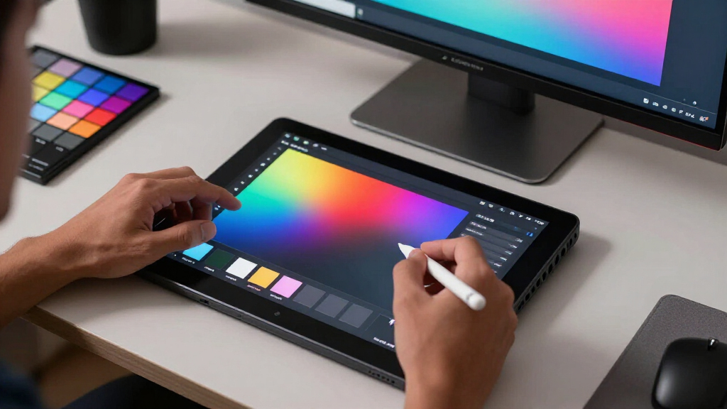
professional drawing tablet with accurate color
As an affiliate, we earn on qualifying purchases.
As an affiliate, we earn on qualifying purchases.
Which Gamut Coverage Do Artists Really Need?
| Use Case | Recommended Gamut Coverage |
|---|---|
| Web, social media, UI design | Near-100% sRGB |
| Modern illustration, multimedia work | Strong Display P3 |
| Photography, print production | High Adobe RGB |
| HD Video, streaming content | Rec.709 |
| HDR and high-end video finishing | P3-class + HDR features |
Matching your display’s gamut to your primary output isn’t just about meeting a spec; it’s about ensuring what you see on screen translates accurately to your final medium. For instance, near-100% sRGB is sufficient for most web-based work, but if you’re printing photographs or working in HDR video, a wider and more precise gamut like Adobe RGB or Display P3 becomes essential. However, wider gamuts can introduce challenges, such as oversaturation or color shifts if the display isn’t properly calibrated or if your workflow isn’t color-managed. Moreover, having a wide gamut doesn’t automatically mean your colors will be accurate—it’s the calibration and how well you manage color profiles that determine reliability. The key is to choose a display that matches your output medium and to understand that more coverage is only beneficial when paired with proper calibration and workflow practices.
pen display for digital artists with wide color gamut
As an affiliate, we earn on qualifying purchases.
As an affiliate, we earn on qualifying purchases.
Why Gamut Volume and Accuracy Can Trick You
High gamut volume or large percentages can be deceiving because they focus on size rather than quality. A display might boast 150% sRGB volume, but if it oversaturates or misrepresents certain hues, your colors could look vivid but unnatural—especially in skin tones or natural greens. This oversaturation can make your artwork appear vibrant on your screen but drastically different when printed or viewed on other devices. Similarly, a high volume doesn’t guarantee that the display’s colors are true to their source; it merely indicates the potential range. Without proper calibration, these wide-gamut displays can produce inconsistent results, leading to color shifts and mismatched output. The real goal is to achieve consistent, accurate colors across your workflow. Bigger numbers can tempt you into thinking the display is better, but unless you also prioritize calibration, understanding the color profile, and verifying Delta E values, those impressive specs can be misleading. Remember, size alone isn’t enough—accuracy and proper workflow integration are what ultimately determine color fidelity.
color calibration tools for pen displays
As an affiliate, we earn on qualifying purchases.
As an affiliate, we earn on qualifying purchases.
Beyond Gamut: What Other Specs Keep Your Colors True
While gamut coverage is a key factor, it’s not the whole story. A display’s ability to produce accurate colors depends heavily on factory calibration, uniformity, contrast ratio, bit depth, and surface finish. For example, a display with excellent color coverage but poor uniformity can result in inconsistent colors across the screen, making it difficult to trust your work. Similarly, a high contrast ratio enhances perceived color depth, especially in HDR content, but only if the display can sustain high luminance levels without crushing blacks. Bit depth, such as 10-bit support, allows for smoother gradients, reducing banding and color transitions. Surface finish also impacts perceived color accuracy; matte screens reduce reflections but can introduce haze, affecting color perception. Therefore, considering these factors together—calibration, uniformity, contrast, bit depth—ensures you select a display capable of delivering consistent, true-to-life colors, rather than relying solely on a percentage figure.
How to Choose a Pen Display That Matches Your Color Needs
- Identify your primary output: web, print, video, or HDR.
- Check the display’s color space compatibility—aim for near-100% sRGB or wider if needed.
- Look for independent calibration reports and Delta E values under 2 to ensure color accuracy.
- Ensure the display offers consistent brightness and color uniformity across the entire screen. Variations can cause color shifts that undermine your work’s consistency.
- Verify hardware calibration support if your workflow demands precise color management. This allows you to maintain accuracy over time.
- Test the display in your working environment, paying attention to reflections, glare, and comfort during extended sessions. A display that looks good in a store might not perform as well in your studio.
For example, if you’re printing photos, prioritize Adobe RGB coverage and calibration to match your print profiles. For web art, sRGB is usually sufficient, but ensure the display is well-calibrated for consistent results. Matching your display’s capabilities to your output medium and workflow prevents surprises and saves time in the long run.
Remember: the best display is one that aligns with your needs—more than just the highest spec sheet numbers.
Keeping Your Colors Accurate Over Time
Gamut coverage and calibration aren’t static; they drift over time due to environmental factors, aging components, and software updates. Regular calibration—ideally every one to three months—is essential to keep your colors consistent and reliable. For professionals working with print or high-end video, even slight deviations can cause noticeable differences in output. For instance, a photographer who calibrates monthly ensures that their prints match what they see on screen, maintaining professional standards. Investing in a quality colorimeter or spectrophotometer makes this process straightforward and accurate. Additionally, always profile your display after calibration, and use color-managed software to maintain consistent color workflows. This proactive approach minimizes surprises and keeps your work predictable across different stages of production.
The Future of Pen Display Color Tech: What’s Changing?
Emerging panel technologies like OLED and Mini-LED are revolutionizing display quality by offering deeper blacks, higher contrast ratios, and broader color gamuts. These advances enable more vibrant, accurate images and can significantly improve your workflow if paired with proper calibration. Manufacturers are also pushing higher refresh rates, USB-C connectivity, and expanded HDR capabilities, which enhance responsiveness and usability. However, these features alone don’t guarantee color accuracy; calibration and proper workflow integration remain essential. As technology progresses, we’re moving toward displays that combine wide color gamuts, high bit depths, and reliable calibration, making professional-grade color management more accessible to everyone. Staying informed about these trends helps you make smarter investments and ensures your workflow keeps pace with technological advancements.
Your Best Bet: Prioritize What Matters Most
For most artists, a display with near-100% sRGB coverage, good calibration, and uniformity will serve better than a wider-gamut panel with poor accuracy. Don’t chase the numbers; chase real-world performance. Remember, a wider gamut isn’t useful if your display can’t reproduce colors faithfully or if your workflow isn’t properly calibrated. Investing in calibration tools and understanding your specific needs ensures that your colors stay consistent and predictable. The goal is to find a display that matches your output medium and provides reliable, accurate colors during every stage of your project. Ultimately, a well-calibrated, appropriately matched display will save you time, reduce frustration, and improve your final results—more than any flashy spec sheet ever could.
Matching your display’s capabilities to your work ensures consistent, predictable results—no surprises, just good colors.
Frequently Asked Questions
Is 100% sRGB enough for digital art?
For most web, social media, and general illustration work, yes—near-100% sRGB coverage is sufficient. If you print or do professional photography, wider gamuts like Adobe RGB or P3 can offer benefits, but only if the display is accurately calibrated.
Does a wider gamut mean better color?
Not necessarily. Wider gamuts can produce more vivid colors, but if the display isn’t calibrated or if your workflow isn’t color-managed, it may oversaturate or misrepresent colors. Accuracy and workflow matching matter more than raw numbers.
Should I prioritize Adobe RGB or DCI-P3?
Choose Adobe RGB if you work with print, photography, or prepress. Opt for Display P3 or P3-class coverage if you focus on modern digital media and video. Always verify which version of P3 a manufacturer measures, as they can differ.
How often should I recalibrate my display?
For professional color work, recalibrate every one to three months. Frequent recalibration ensures colors stay consistent as screens drift over time and environmental conditions change.
Can I improve color accuracy without a calibration tool?
Software test images can help tweak brightness and gamma, but they won’t provide reliable, objective calibration. Investing in a colorimeter or spectrophotometer is the best way to ensure true color accuracy for critical work.
Conclusion
Choosing a pen display isn’t about chasing the biggest number. It’s about matching what your workflow needs with what the screen can reliably deliver. A well-calibrated, accurately profiled display that aligns with your output medium will serve you far better than a flashy spec sheet.
Remember, consistent color isn’t magic—it’s careful setup, routine calibration, and knowing your target. Keep your workflow simple, your expectations realistic, and your colors will stay true, project after project.
Fall Picks
fall essentials
As an affiliate, we earn on qualifying purchases.


![Amazing Graze [Stan Kelly]](https://artzartz.com/wp-content/uploads/2026/10/amazing-graze-stan-kelly-featured-260x140.jpg)