
TL;DR

Get audio and creator gear delivered free with Prime
- Fast, free delivery on millions of items
- Prime Video, Amazon Music and more included
- Member-only deals all year
Paper-like textures on pen displays enhance tactile control but may reduce clarity or increase glare. Choosing the right balance depends on your workflow and preferences. New tech offers customizable options, but costs vary.
Imagine drawing on a surface that feels almost like real paper—grainy, tactile, responsive. That’s what many artists and writers crave from their digital tools. But behind this cozy illusion lie trade-offs. You need to weigh how a textured screen impacts your work, durability, and overall experience.
This guide cuts through the hype. We’ll explore the different types of paper feel textures, recent tech innovations, and what you should expect when choosing a pen display with a textured surface. Get ready to make smarter decisions—no more guessing if a rough surface is just a gimmick or genuinely worth it.
Choosing a textured screen involves balancing tactile feedback with screen clarity and durability.
Recent innovations include nano-textures and hybrid surfaces that better mimic paper feel without sacrificing visual quality.
Cost and wear are important factors—higher-end textures last longer but come at a premium.
Test different surfaces if possible—your fingers are your best guide to what feels right.
Future tech will offer more customization, making your digital workspace feel more like real paper.
Paper Feel Screen Textures: Trade-Offs to Know
A grainy surface can make digital strokes feel grounded, deliberate and reassuringly physical. The same texture may soften detail, wear stylus nibs and add cost. The best surface is not the roughest—it is the one that supports your actual workflow.
Resistance rises across the spectrum.
Pronounced grain may soften the image.
Both can change with heavy use.
Preference is tactile and personal.
Three feels, three different priorities
Paper feel comes from coatings, etched glass or removable films. Each alters stylus resistance, reflections and perceived sharpness in a different way.
Matte finish
Moderate tooth, reduced glare and controlled strokes. A versatile middle ground for handwriting, sketching and mixed creative work.
Rough / grainy
Strong resistance that closely recalls paper grain. It can improve line confidence, but may increase fatigue, haze and nib wear.
Smooth surface
Fast, fluid stylus travel with maximum display vibrancy. Best when fine detail and color fidelity matter more than paper-like drag.
Where each surface wins—and yields
These are directional comparisons, not laboratory scores. Coating quality, lighting and stylus tip design can shift the experience.
| Feature | Matte finish | Rough / grainy | Smooth surface |
|---|---|---|---|
| Grip & feel | ✓ Moderate, controlled | ✓ High, paper-like grain | ✗ Low, slick glide |
| Clarity & color | ✓ Good, slight diffusion | ~ May dull fine detail | ✓ Excellent vibrancy |
| Glare control | ✓ Strong in bright rooms | ~ Angle dependent | ✗ Reflections more visible |
| Durability | ~ Moderate wear | ✗ More surface and nib wear | ✓ Typically most durable |
| Cost tendency | ~ Mid-range | ✗ Premium when engineered | ✓ Often standard |
| Best suited to | General creative work | Sketching and handwriting | Color and detailed rendering |
Texture changes more than touch
The stronger the surface grain, the more carefully you should assess visual diffusion, cleaning needs, nib consumption and long-session comfort.
A satisfying surface balances three competing demands.
Choose enough resistance to stabilize your stroke, but not so much that the texture distracts your eyes or exhausts your hand.
Choose from the work backward
A useful texture decision begins with your task—not with a marketing label such as “paper-like.”
Sketch, write, paint or render?
Bright rooms reward glare control.
Tip material changes the glide.
Try curves, hatching and long strokes.
Decide what you can compromise.
Illustrators
Prioritize line control, then inspect fine-detail sharpness and hand fatigue over a longer session.
Color-critical artists
Favor restrained matte or smooth finishes that preserve vibrancy and reduce surface sparkle.
Note-takers
Look for moderate resistance, low glare and comfortable friction across repeated daily writing.
Mixed workflows
Consider a balanced matte panel or removable overlay so tactile feel can change with the task.
Paper feel is becoming adjustable
Recent development focuses on preserving clarity while making friction more authentic, durable and adaptable.
Nano-textures
Finer structures aim to reproduce paper fiber resistance with less haze, color dulling and visual sparkle.
Hybrid surfaces
Layered coatings and removable overlays offer a practical path between tactile control and clean display output.
Variable resistance
Emerging haptics may let users adjust drag by application, tool or task—without replacing the screen surface.
Do not pay for maximum roughness by default. Test the surface, examine it under your normal lighting, confirm stylus compatibility and factor replacement nibs or overlays into the real ownership cost.
What Are Paper Feel Screen Textures, and Why Do They Matter?
Paper feel textures are coatings or surface treatments designed to mimic the tactile experience of writing or drawing on paper. They range from smooth matte finishes to rough, grainy surfaces that add resistance.
For example, a matte finish can reduce glare and make strokes feel more controlled—ideal for sketching or handwriting. A rougher texture, like a fine sandpaper, offers more grip but can wear down styluses or cause fatigue during long sessions.
Choosing the right texture is crucial because it directly influences control and comfort. A smoother surface might allow for more precise, fluid strokes, which is essential for detailed work. Conversely, a textured surface can provide the tactile feedback that mimics traditional media, helping artists feel more connected to their work. However, these textures also impact how the screen reflects light and how durable the surface remains over time, affecting your overall experience and device longevity.
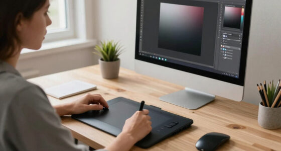
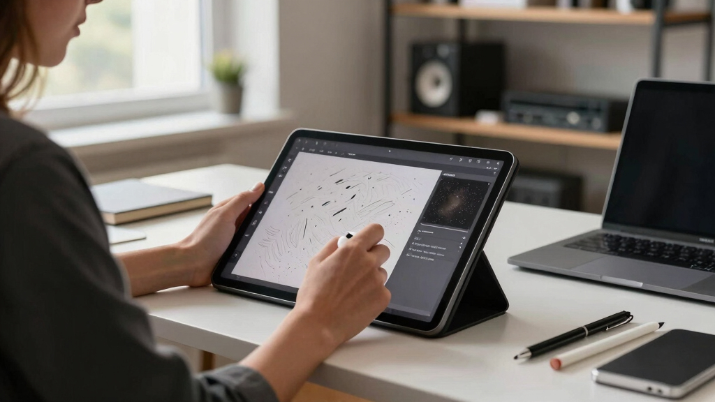
pen display with paper-like texture
As an affiliate, we earn on qualifying purchases.
As an affiliate, we earn on qualifying purchases.
How Do Recent Tech Improvements Make Paper Feel More Natural?
New coatings and surface technologies are pushing the boundary of what’s possible. Manufacturers now use nano-textures and micro-engraved surfaces that feel more like real paper without sacrificing screen clarity.
For instance, some devices incorporate layered coatings that simulate the subtle roughness of paper fibers—improving tactile feedback without dulling colors or reducing sharpness.
Hybrid surfaces are emerging, blending smooth and textured areas to balance control and visual fidelity. Plus, adjustable textures or removable overlays let you customize the feel—giving you control over your tactile experience.
These innovations matter because they allow artists and note-takers to enjoy a more authentic, paper-like experience without sacrificing the visual clarity necessary for detailed work. They also reduce the need for external screens or overlays, streamlining your workflow and reducing clutter.
As an affiliate, we earn on qualifying purchases.
Trade-Offs You’ll Face With Textured Screens
Textured screens aren’t perfect. They can reduce screen clarity, introduce glare, or wear out over time. For example, a very rough surface might make colors look muted or cause reflections that distract you during work.
Durability is another concern. Coatings can degrade with frequent cleaning or heavy use, leading to a less consistent feel or appearance after months of use. This can impact your workflow because a worn surface might demand more pressure or cause stylus fatigue, ultimately affecting your precision and comfort.
Cost is also a factor. Advanced or customizable textures tend to add hundreds of dollars to a device’s price. So, you’re paying for a tactile experience that may come with visual compromises or longevity issues. This means you should consider whether the enhanced tactile feedback justifies the potential downsides in clarity and durability for your specific needs.
Understanding these trade-offs helps you decide what level of tactile feedback is worth sacrificing some visual fidelity or longevity, ensuring your choice aligns with your workflow and expectations.
pen display screen protector with texture
As an affiliate, we earn on qualifying purchases.
As an affiliate, we earn on qualifying purchases.
Comparison Table: Texture Features, Pros, and Cons
| Feature | Matte Finish | Rough/Grainy Surface | Smooth Surface |
|---|---|---|---|
| Grip & Feel | Moderate, reduces glare | High, mimics paper grain | Low, slick and glide-friendly |
| Clarity & Color | Good, minimal distortion | May slightly dull colors | Excellent, vibrant display |
| Glare & Reflection | Low glare, better for bright environments | Can cause reflections depending on light angle | Minimal glare, easy to view |
| Durability | Moderate, wears slowly | Lower, more prone to wear | Most durable, less prone to damage |
| Cost | Moderate | Higher for customized options | Lower, standard surfaces |
As an affiliate, we earn on qualifying purchases.
Tips for Choosing the Right Paper Feel Surface for You
1. Identify your main use: Are you sketching, detailed illustration, or handwriting? This determines whether you need more grip or smoother glide.
2. Consider your environment: If you work in bright light, a matte or textured surface with low glare is better.
3. Think about stylus compatibility: Some styluses perform better on smoother surfaces, others excel with textured ones.
4. Budget wisely: Higher-end textured screens can cost more but may last longer or offer better control.
5. Test before buying: If possible, visit a store to feel different surfaces—your fingers will tell you what works best.
Future Trends in Paper Feel Tech
Expect more customizable and adaptive textures. Some devices will let you switch textures on the fly or adjust resistance levels, much like a touchscreen with haptic feedback.
Innovators are also exploring coatings that self-heal or resist wear, extending the lifespan of textured surfaces.
Plus, integrated stylus tech will get smarter—pressure sensitivity and tilt recognition will feel even more natural on textured screens, closing the gap with real paper.
All signs point to a future where your digital workspace feels indistinguishable from traditional paper—without sacrificing clarity or durability.
Frequently Asked Questions
Do textured screens affect stylus accuracy?
Most high-quality textured screens are designed to maintain accuracy, but very rough textures might cause slight deviations or fatigue over long sessions. Testing your stylus with different textures helps ensure precision.
Are textured screens more prone to wear and tear?
Yes, coatings on textured surfaces can degrade over time, especially with frequent cleaning or rough handling. Proper care extends lifespan, but expect some wear after prolonged use.
Can I change or customize the screen texture?
Some devices offer removable overlays or adjustable textures, but most have fixed surfaces. Customization options are limited but growing as technology advances.
Which devices have the best paper-like feel?
Models from brands like Wacom, Huion, and XP-Pen incorporate textured surfaces designed for natural drawing and writing. Check specifications to match your preferred tactile experience.
Does a textured screen impact color accuracy?
Pronounced textures can reduce vibrancy or introduce slight color dulling. Manufacturers aim to balance tactile feel with visual quality, but testing in person helps confirm your preference.
Conclusion
Picking a paper feel screen is about finding your sweet spot between tactile pleasure and visual clarity. Don’t just chase the roughest surface—think about what supports your workflow and how long it will last.
In the end, a well-chosen textured display can make your digital art or notes feel more natural, inspiring you to create more freely. Your perfect balance is out there—just a feel away.
Fall Picks
fall essentials
As an affiliate, we earn on qualifying purchases.